Background
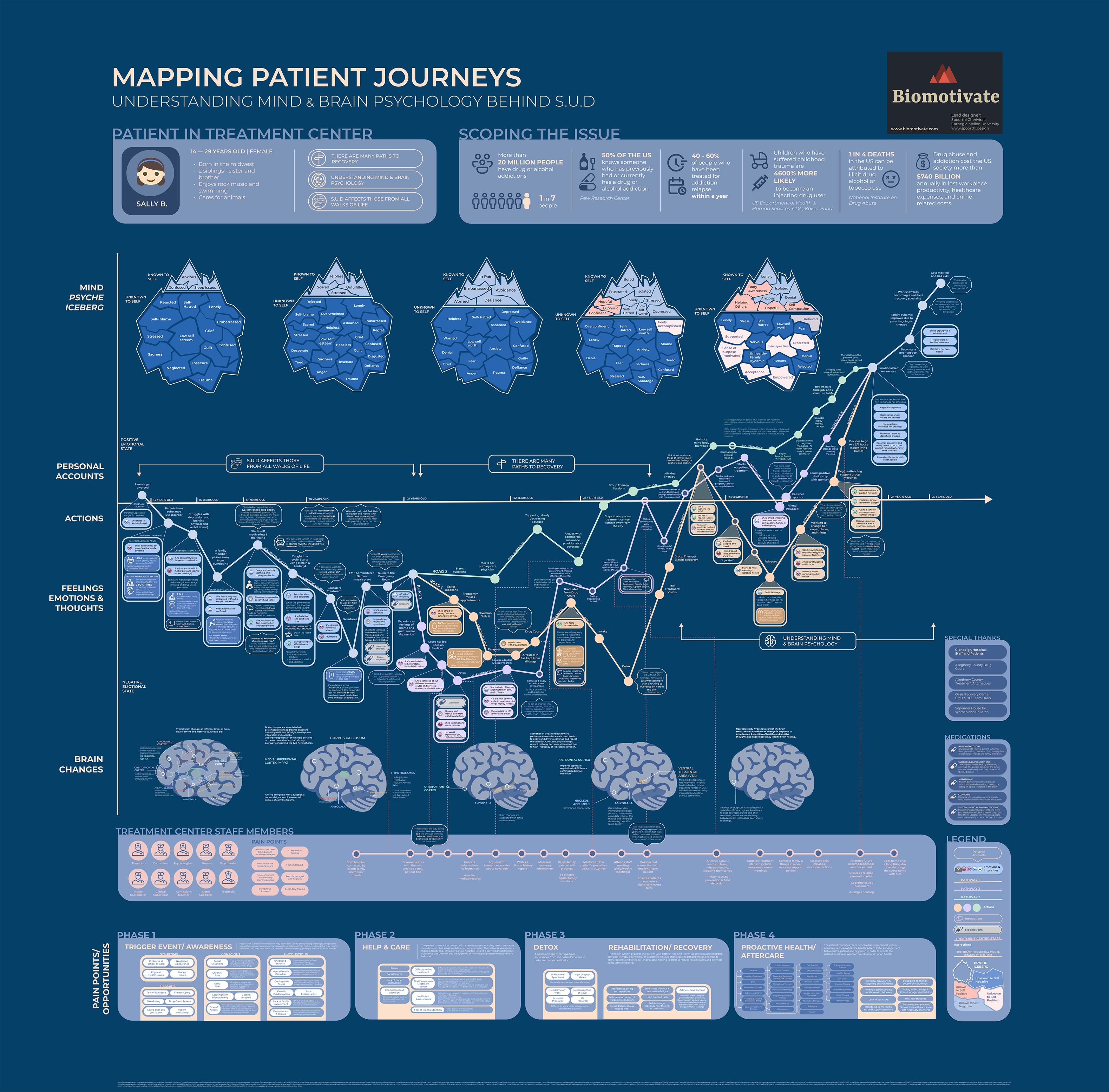
Biomotivate’s Patient Journey Poster explores the neuroscience and psychology behind substance use disorder.
The patient journey poster, designed by Spoorthi Cherivirala, includes:
1. Identifying the problem
2. Patient persona
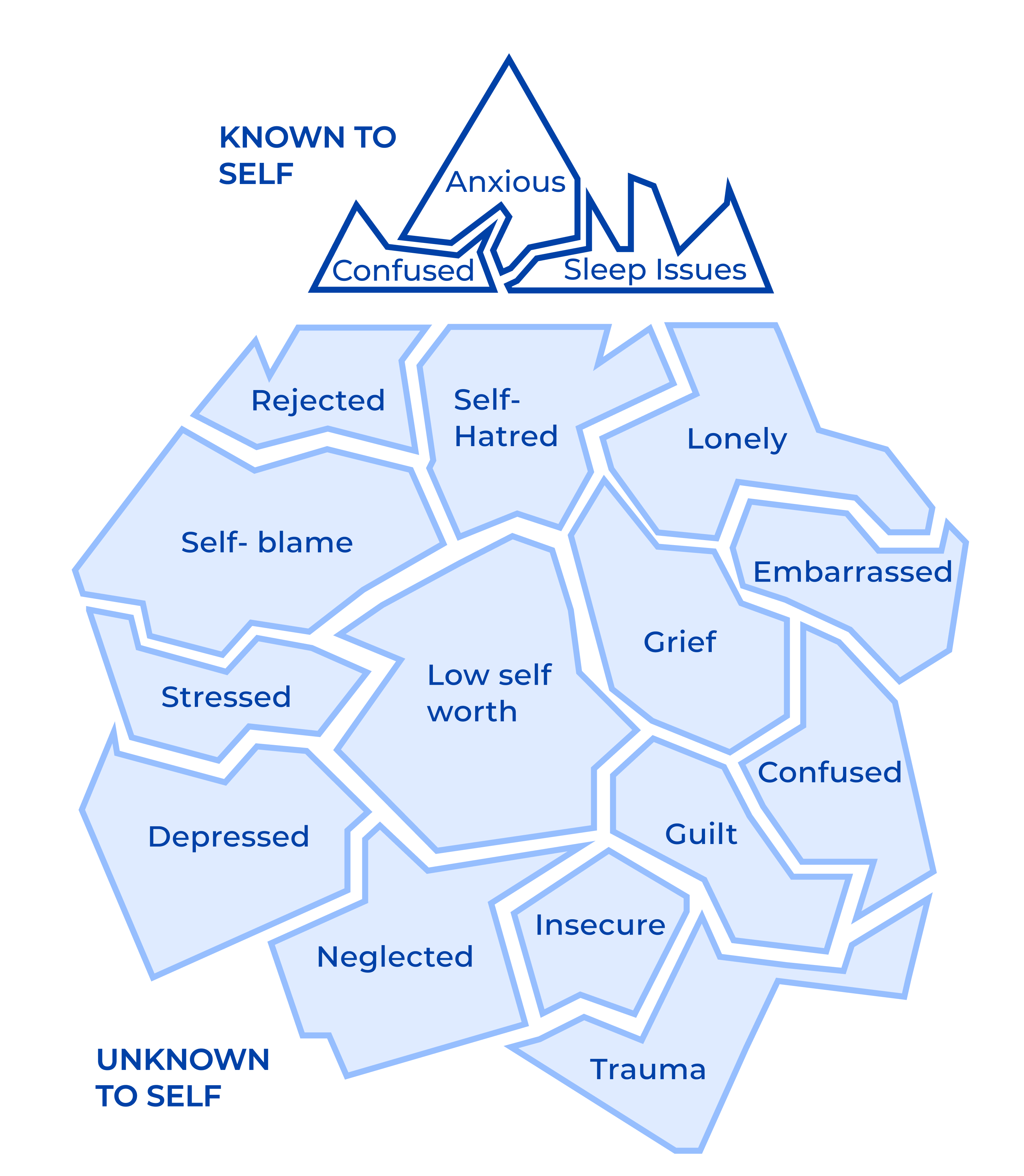
3. The Mind Psyche Icebergs, which illustrate the known and unknown emotions experienced by the patient
4. A timeline of actions and corresponding feelings and thoughts
5. Three paths to recovery
6. Brain regions associated with each event
7. Introductions to treatment centers
8. Pain points and opportunities throughout the journey
9. Medications
Problem Statement
The current patient journey poster is very information-dense and was designed for medical professionals, making it inaccessible to the general public.
The patient journey poster was created for the “Drug Addiction Treatment” Challenge held by the National Institute on Drug Abuse (NIDA), with drug abuse medical professionals as the target audience. The poster contains a large amount of information and is text-heavy, making it difficult for non-professionals to understand the content. Additionally, people may lack the patience to read through all the text.
Project Goal + Target Audience
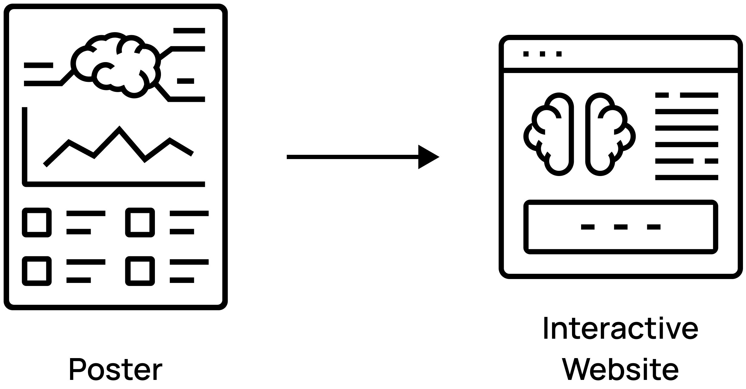
Transform the poster into an interactive website that educates the general public about addiction and recovery.
The goal is to educate people about addiction and recovery through an interactive website, ensuring they can easily access and learn from the provided content. The website’s target audience is the general public with no prior neuroscience background, including individuals curious about the substance use disorder recovery process or seeking recovery approaches, rather than just professionals involved in medical treatment.
Poster Content Streamlining
Streamline the poster content by keeping only the most essential information: three paths to recovery, icebergs, brains, and timelines.
Since the main target audience of the website is non-professionals, the journey content should be presented in a more accessible and easy-to-read format. Given the complexity and abundance of information in the poster, the content has been refined for the website, focusing on the most essential details: the three paths to recovery, the mind psyche icebergs, brains, and timelines.

Restructured Content
The website will illustrate Sally’s journey, encompassing family struggles, emotional challenges, substance use disorders, treatment, and eventual recovery.
Her journey consists of five stages, with three possible roads to recovery.

In each stage, there is a Mind Psyche Iceberg, a Brain, and a Timeline.


Mind Psyche Iceberg
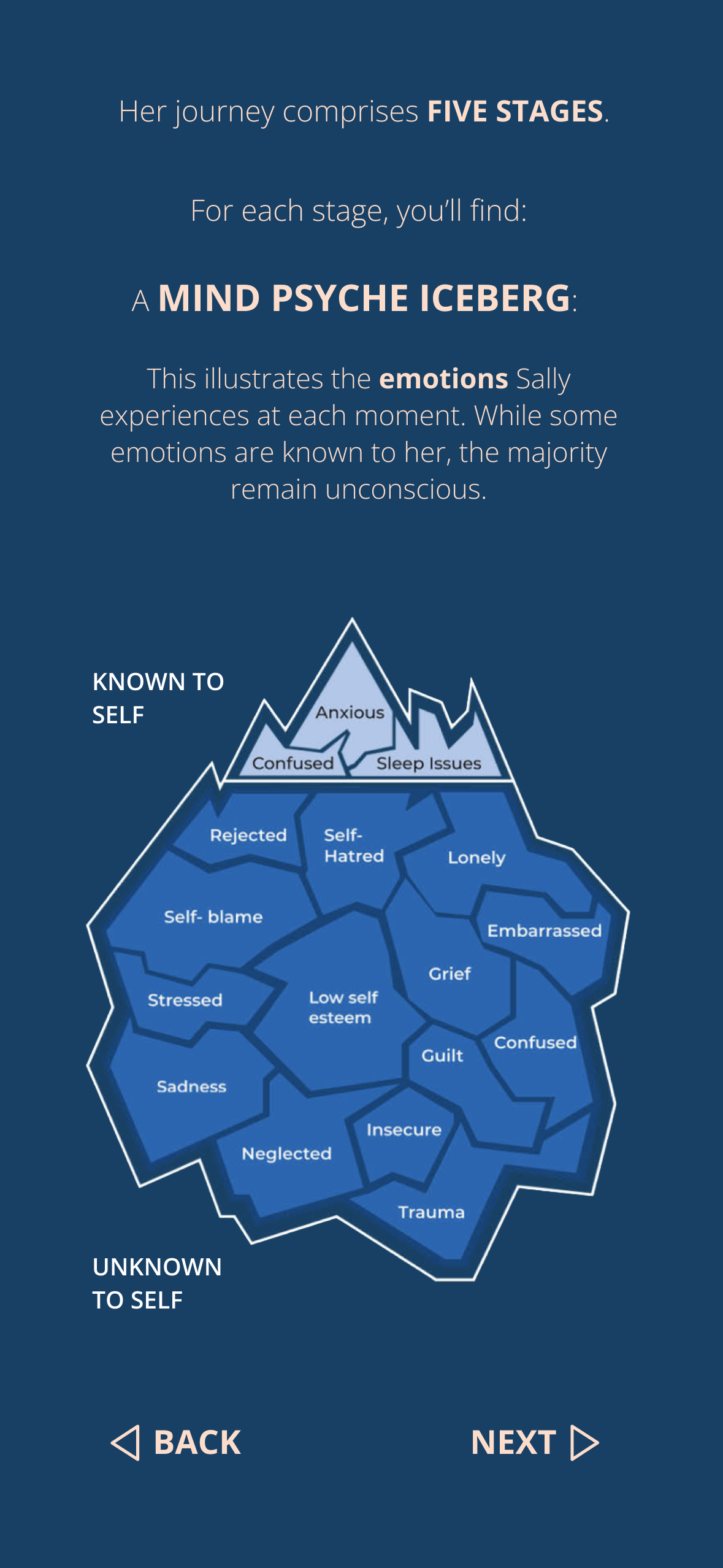
This shows the emotions Sally experiences at each stage.
Initially, negative emotions are identified and displayed. While some are known to her, most are not. As treatment progresses, more emotions become known to her, and some negative emotions transform into positive ones.
Original Version
Areas for Improvement
Lack of Responsive Design:
The design does not adapt well to different screen sizes; content appears large on a desktop but too small on a mobile phone.
Excessive Brain Content:
The brain images contain too much text, making them difficult to read.
Confusing Road buttons:
The road buttons are identical, making it hard to differentiate between the three paths.
Iteration 1: Static UI Prototype
Design a responsive website with two layouts to accommodate both desktop and mobile screens.
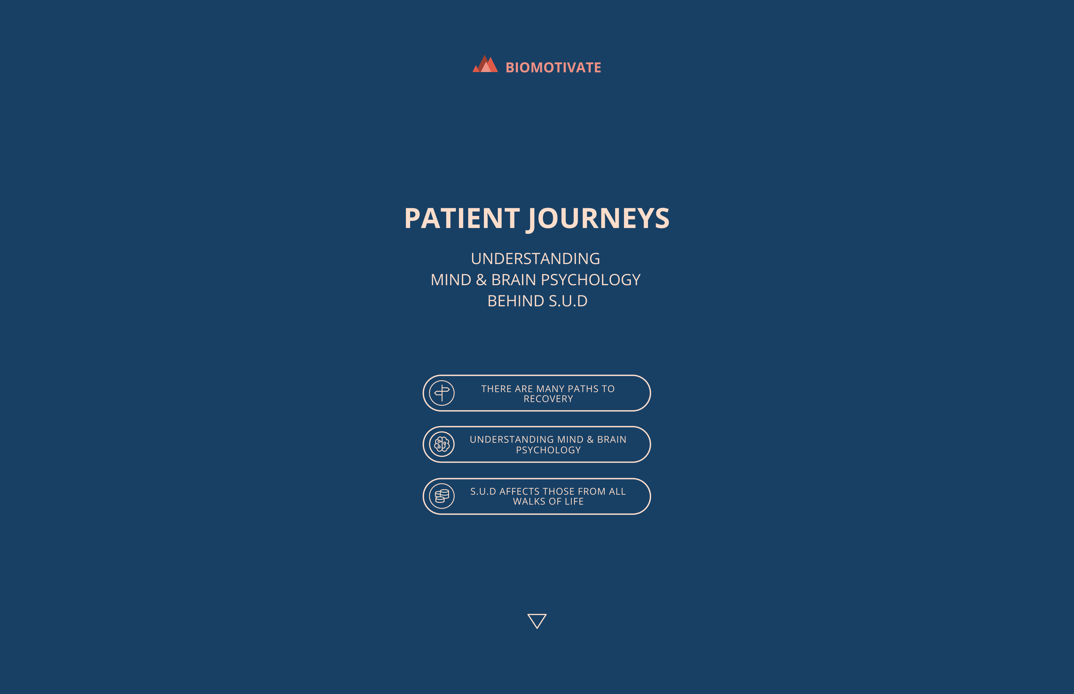
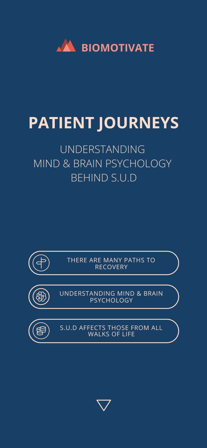
The headline text size has been reduced, and the patient image has been removed to create a neater homepage. Scroll down or click the continue icon (triangular icon at the bottom center) to read the rest of the information.
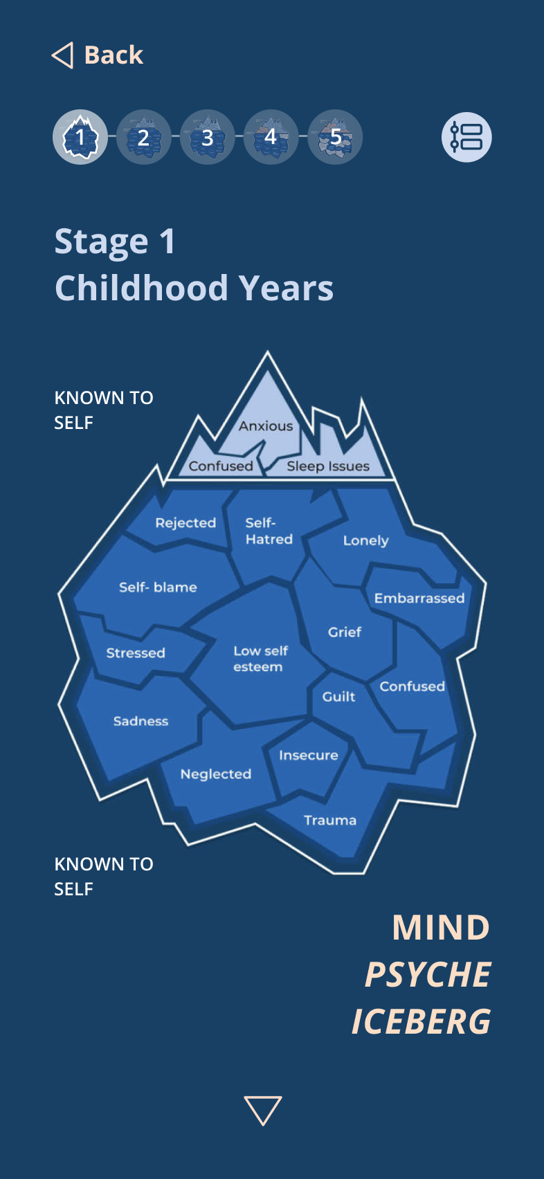
Streamline the Brain image by reducing text and hiding the timeline on the mobile version.
The iceberg thumbnails

have been relocated from the left side to the top center to help users better track the stages.
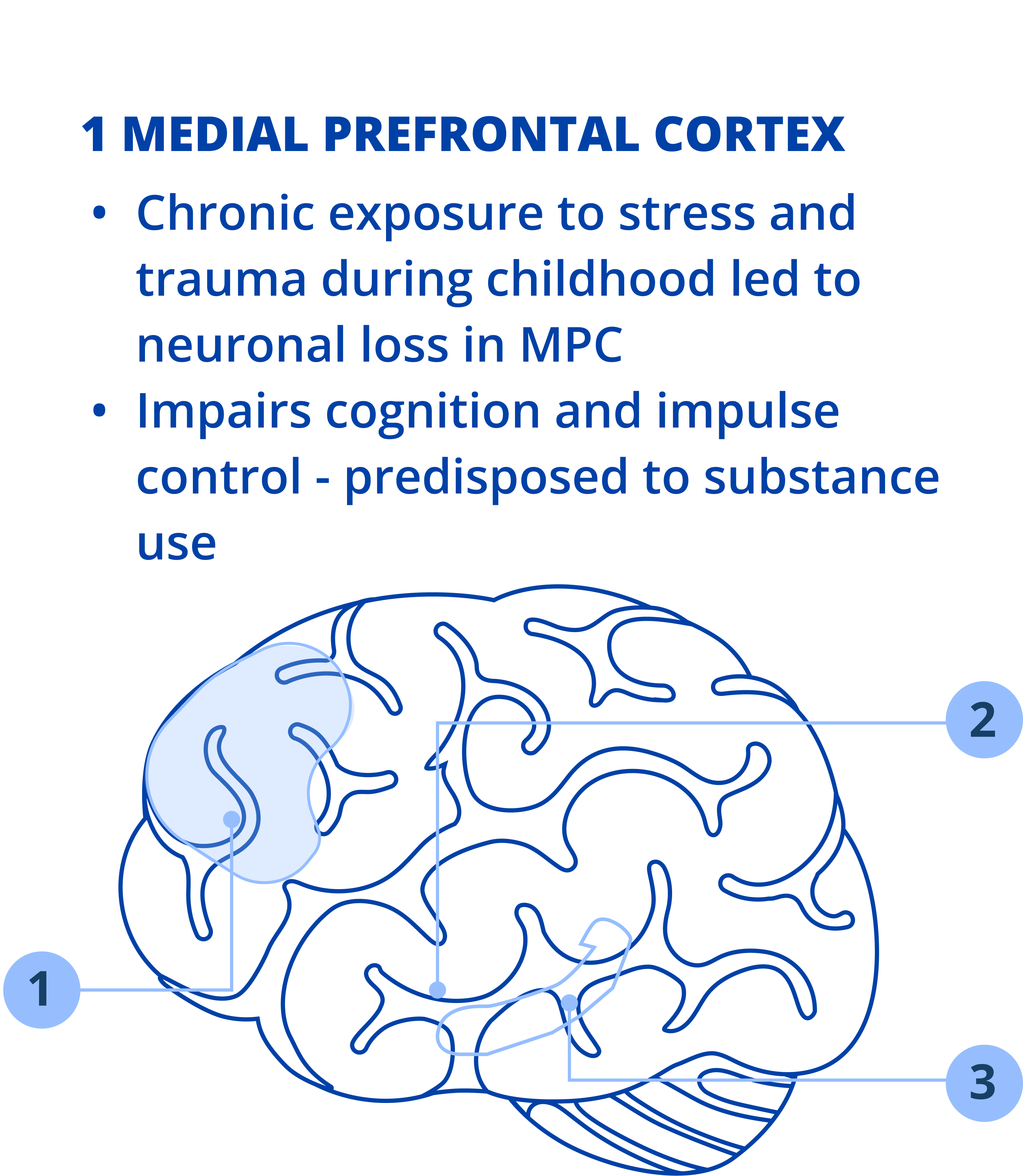
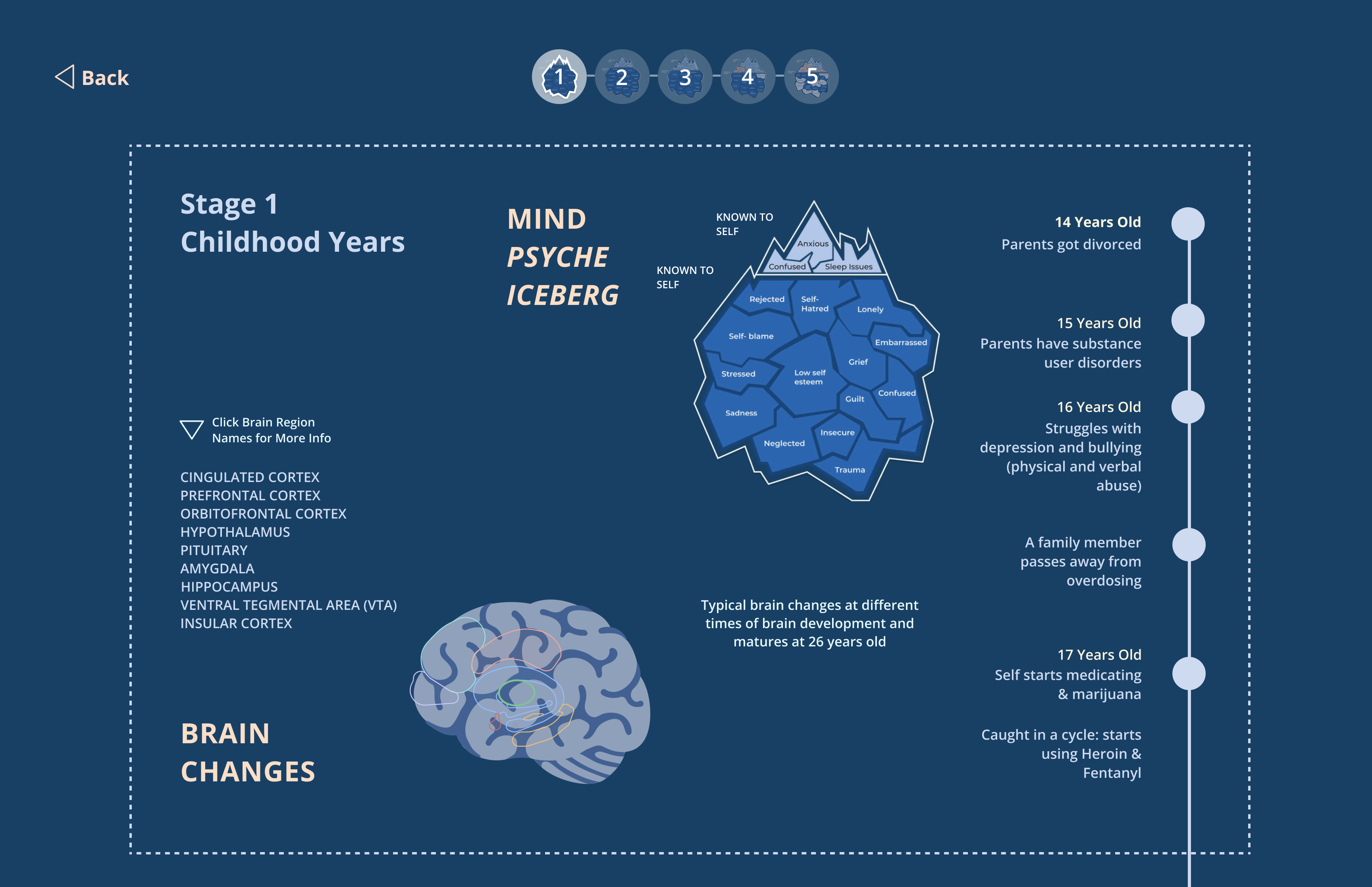
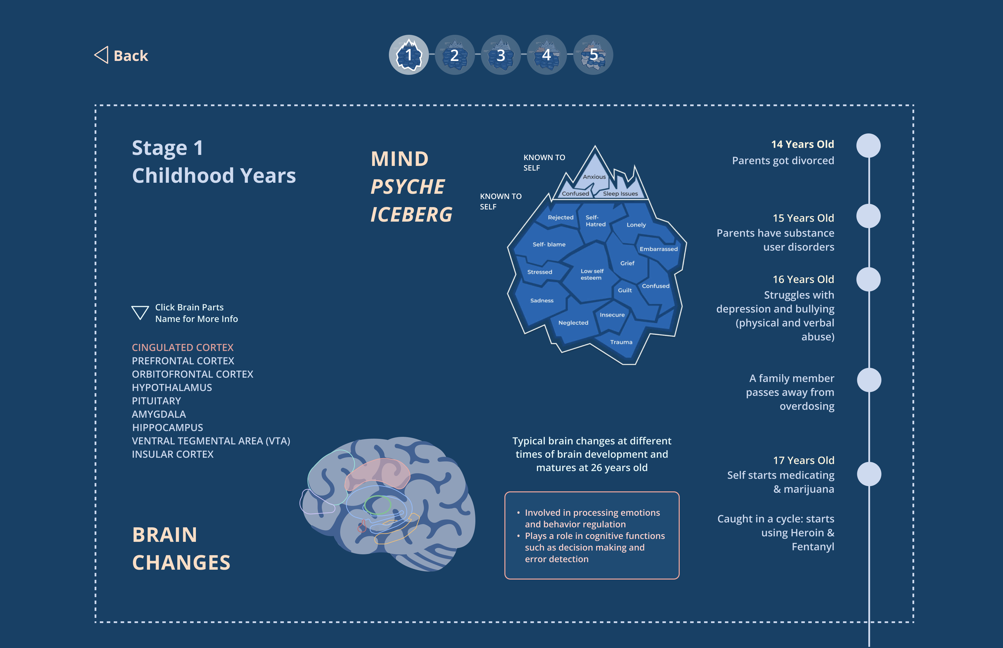
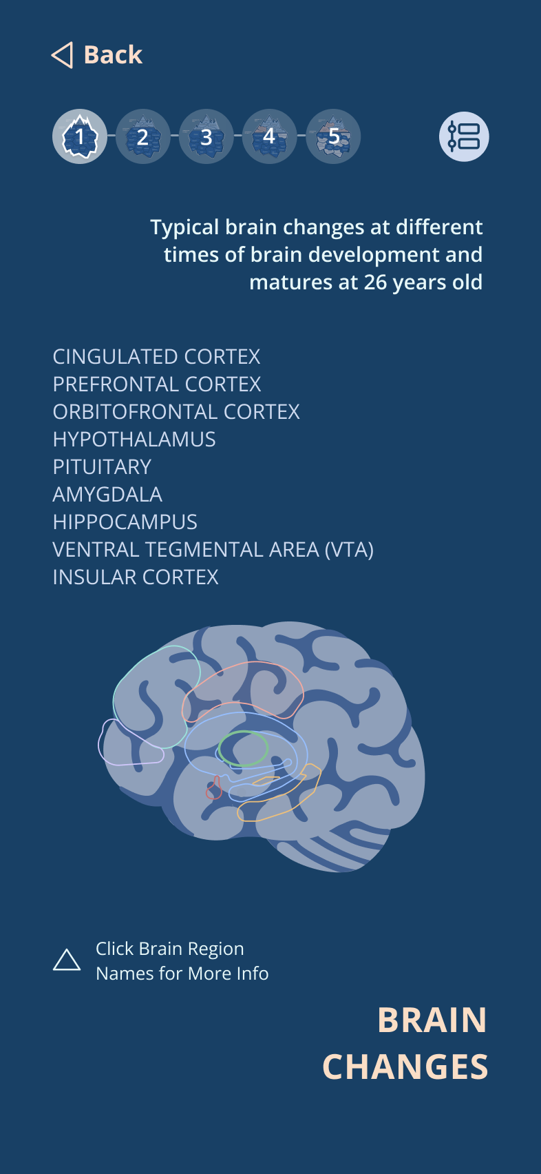
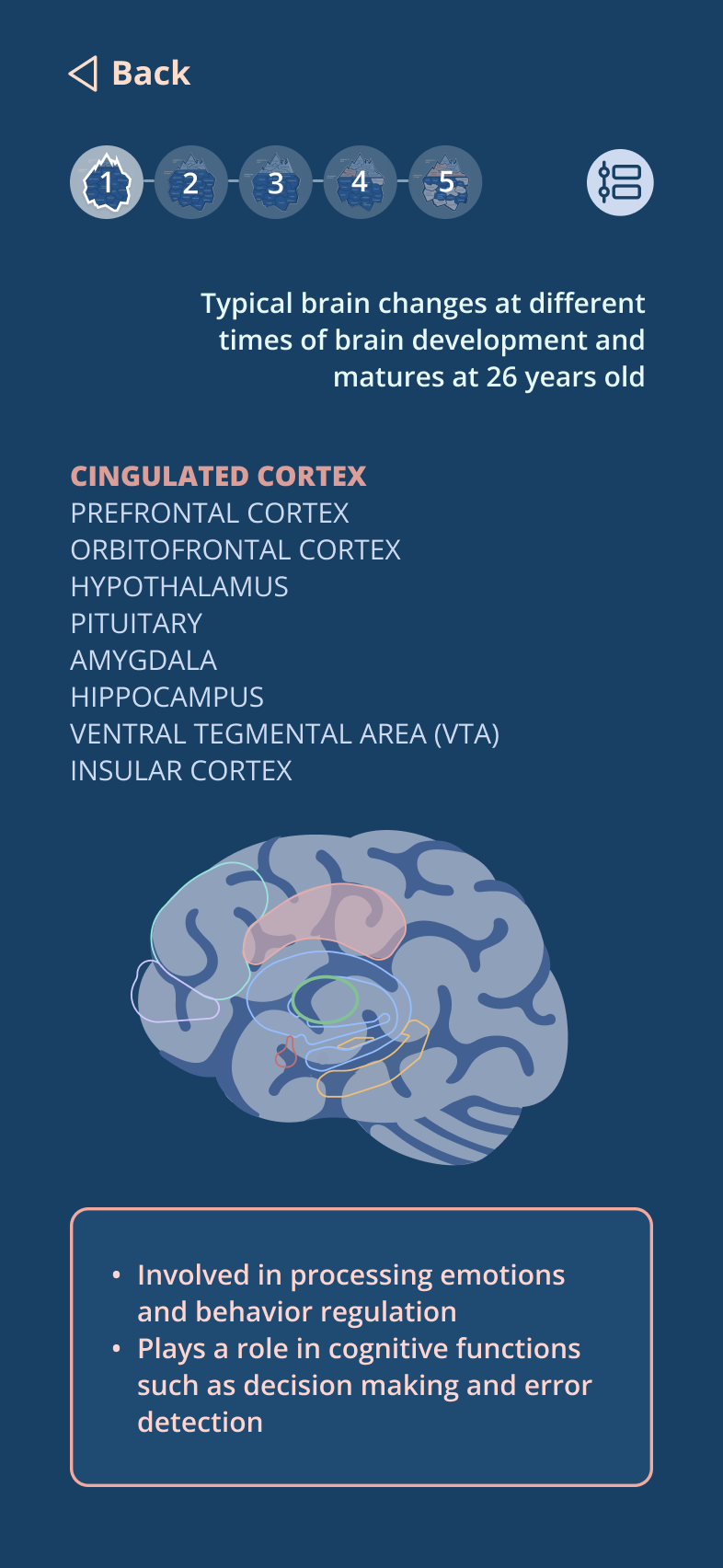
The brain image has been simplified, showing only the brain region names. The explanation for each region will be displayed or updated one at a time, depending on which region name (e.g., CINGULATED CORTEX) is clicked.
Desktop Screen
Iceberg, brain, and timelines are more spaced out to enhance readability and better fit desktop screens.
Mobile Screen
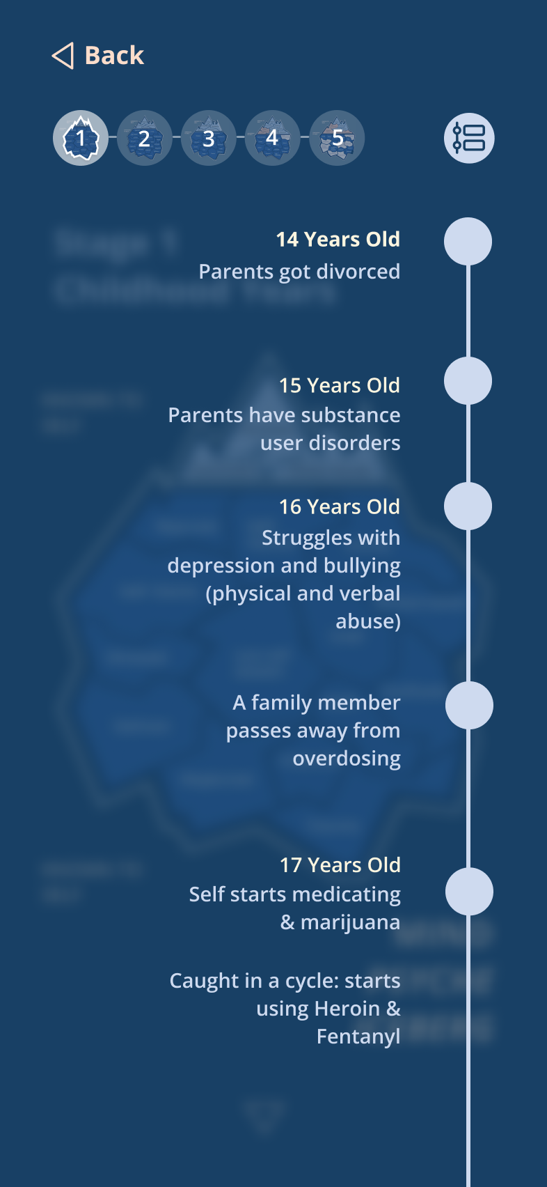
The timeline is hidden on the mobile version and can be displayed by clicking the timeline icon
in the top right corner of the screen.
Usability Testing Feedback
Missing Instructions:
Upon first opening the website, it’s unclear what the website’s purpose is and how to navigate it.
Button Confusion:
The three parallel rounded rectangular subheadings on the homepage resemble buttons, prompting users to click on them, though they are actually non-clickable.
Excessive Neuroscience Terms:
The brain region names add too much text, which may overwhelm or intimidate the audience.
Unclear Structure:
The desktop layout appears somewhat disorganized and lacks a clear structure.
Iteration 2: Static UI Prototype
Click the numbered circles to display the Brain region names and explanations.
Restructure the layout into three parallel columns.
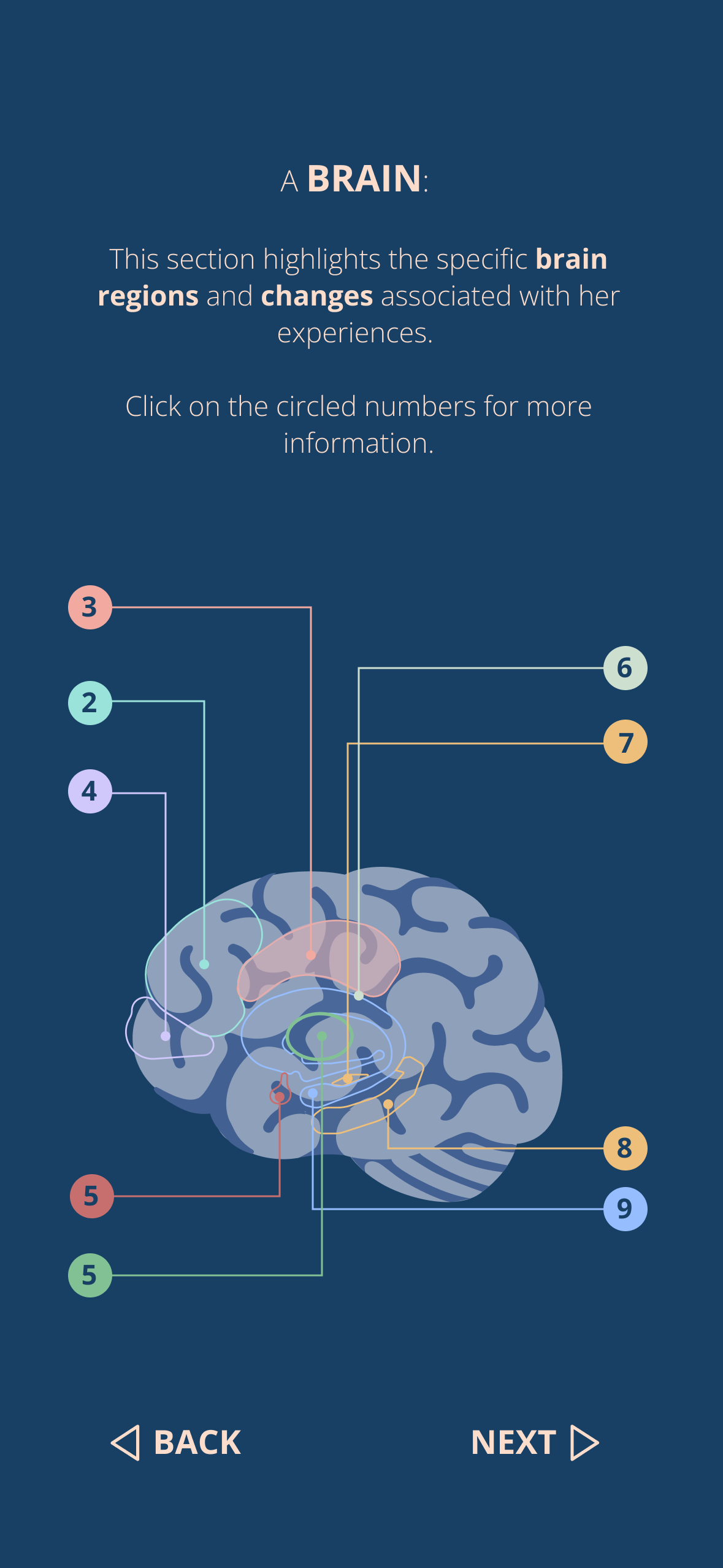
The region names have been replaced with circled numbers, allowing users to click on any number to view the corresponding region name and explanation. This design avoids the need to click directly on specific regions within the brain image, which can be challenging on mobile devices if the regions are too small. A clickable label is also provided to guide users on how to interact with the brain.
Desktop Screen
The desktop layout has been updated to feature three parallel columns, with the Iceberg, Brain, and Timeline each occupying a separate column.
Add onboarding pages to explain the website’s purpose and how to use it.
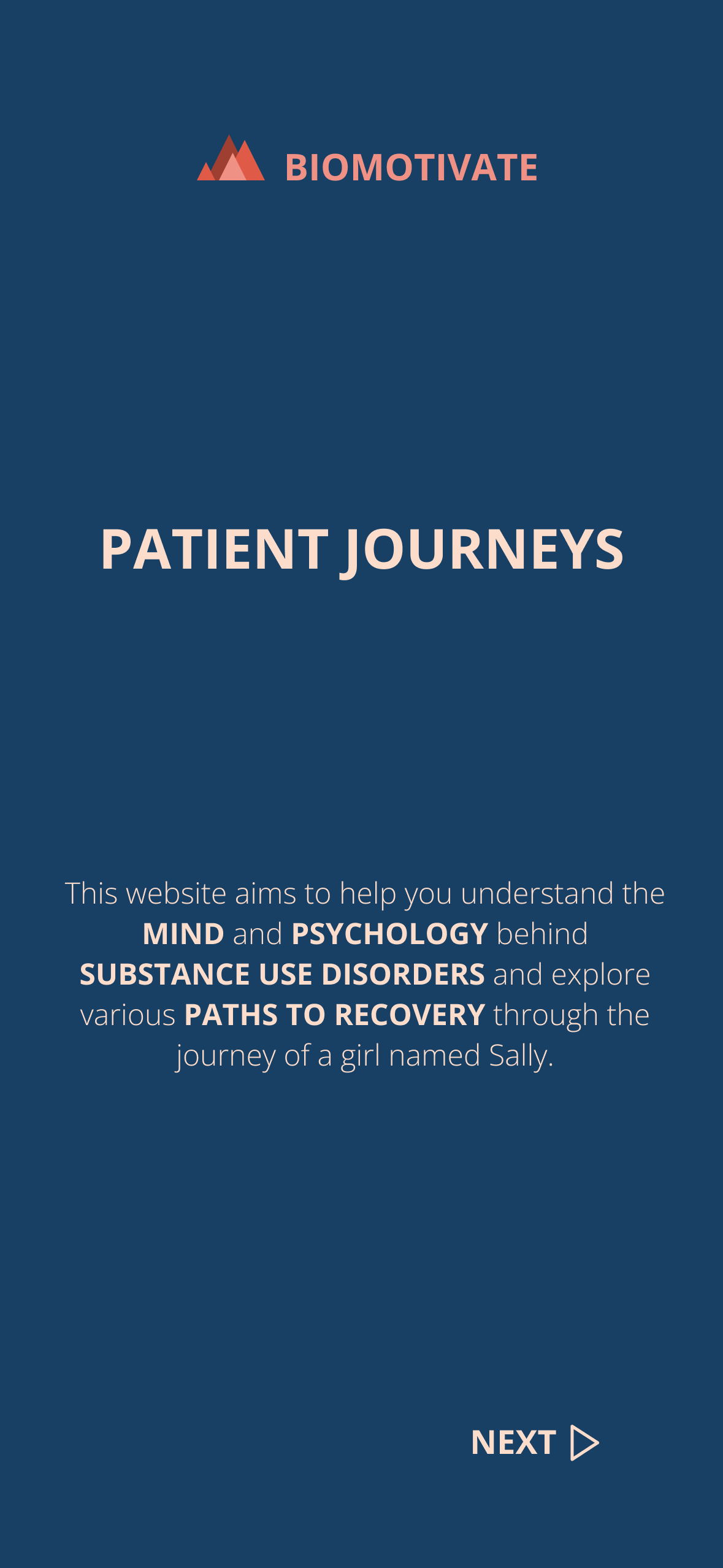
Onboarding pages have been added at the beginning:
- Page 1 explains the purpose of the website.
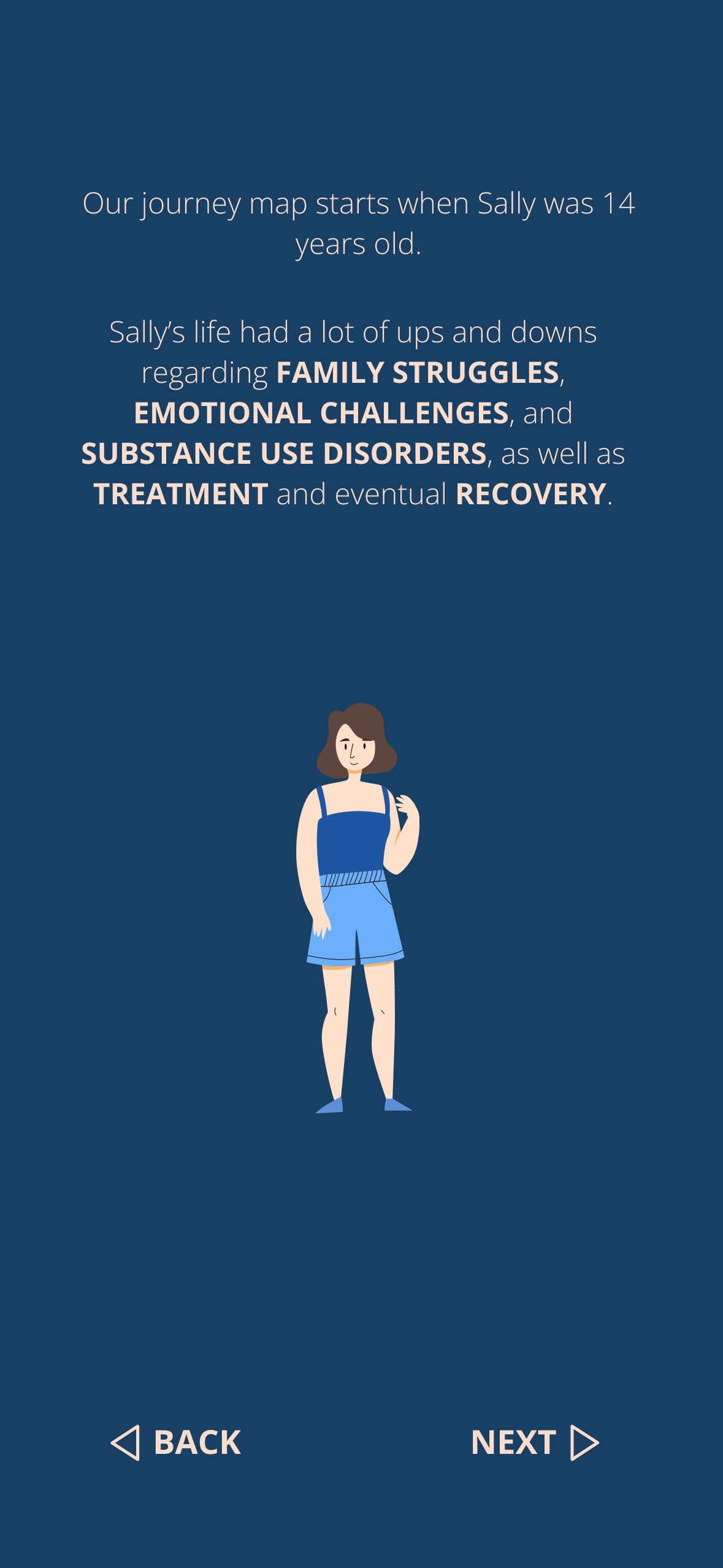
- Page 2 introduces the character Sally and her journey.
- Page 3 explains the concept of the mind psyche iceberg.
- Page 4 details the brain’s purpose and how to interact with it.
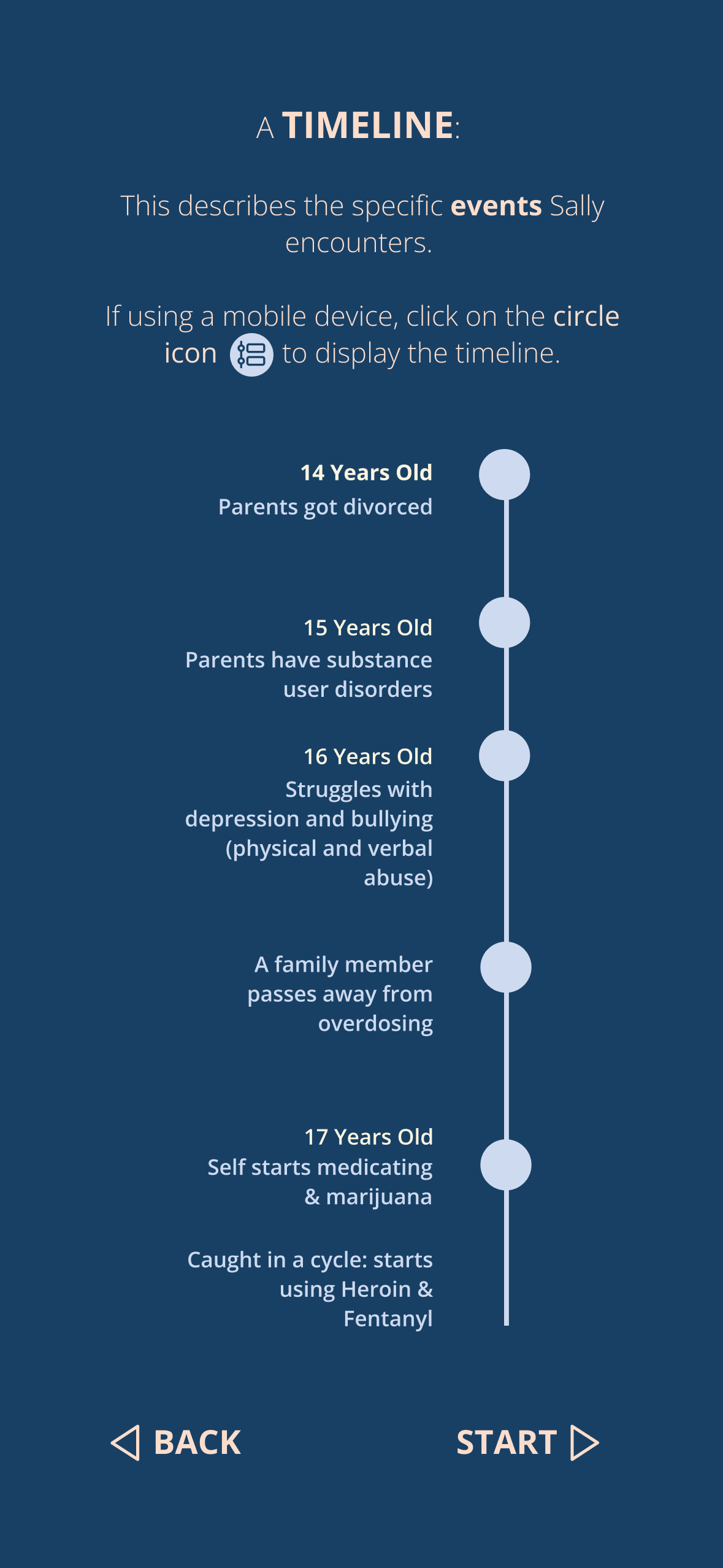
- Page 5 explains the timeline and how to display it on a mobile device.
Mobile Screen
First Interactive Web Prototype
I transformed the static Figma prototypes into the first interactive website prototype using Webflow and embedded HTML, CSS, and JavaScript.

Stages + Iceberg Thumbnails
An iceberg thumbnail highlights when the corresponding stage scrolls into view.
Click an iceberg thumbnail to jump to the corresponding stage.
The iceberg thumbnails highlight the stage currently in view—when a stage is scrolled into view, the corresponding thumbnail is highlighted. For example, if stage 2 is in view, iceberg thumbnail 2 will be highlighted. Users can also jump to a specific stage by clicking on the corresponding thumbnail image.
Roads
Select a road before proceeding to stages 3, 4, and 5.
Click a road button to navigate to the corresponding path.
When clicking thumbnails 3, 4, or 5 for the first time, users will be directed to the "Explore Three Roads" page. Since stages 3-5 are part of three different paths, users must choose a road first. After selecting a road, users can click on iceberg thumbnails 3-5 to navigate to the corresponding stages.
Additionally, once users have completed viewing the final stage of the current road, they will have the option to click the road buttons to switch to other paths.
Additionally, once users have completed viewing the final stage of the current road, they will have the option to click the road buttons to switch to other paths.
Brain
Click the numbered circles to display the Brain region names and explanations.
A clickable label guides the user on how to interact with the brain. This label will disappear once the user performs the action correctly. Users can then click on the numbered circles to explore other brain regions and their explanations, with the corresponding region highlighted on the brain image.
Timeline
Click the timeline icon to reveal the timeline.
If using a mobile device, users can click the timeline icon to reveal the hidden timeline, and click it again to close it. They can also click on the iceberg thumbnails to switch to the timelines of other stages.
Usability Testing Feedback
Unclear Iceberg Onboarding Page:
Present both the positive and negative iceberg imagery in the onboarding.

Confusing Representation of the 3 Roads:
We need to simplify the concept of the 3 roads to make it more understandable and navigable. The term ‘roads’ was used because the original journey map poster resembled a map, but our web version lacks those map elements, making the metaphor unclear. We could incorporate more map visuals from the original poster to clarify that Sally could follow three different paths. Alternatively, we might reconsider using ‘roads’ and instead frame it as a ‘choose your own adventure’ narrative. After selecting a path, we should clearly indicate that other alternative paths are available for exploration.
Excessive Repeated Clicking of Timeline Icon:
Can we simplify the process of guiding users through the narrative of the timeline, especially on mobile? Currently, users must repeatedly click the timeline icon as they scroll through the five steps. If they want to view the alternative timelines for roads 2 and 3, they have to click even more, which could be frustrating, particularly if their focus is more on the timeline than on the brains and icebergs.
Iteration 3: Static UI Prototype
Shift the timeline to the left side to make it more noticeable.
Darken the background to differentiate components and create a more structured layout.
Update the colors to make the three roads more distinct.
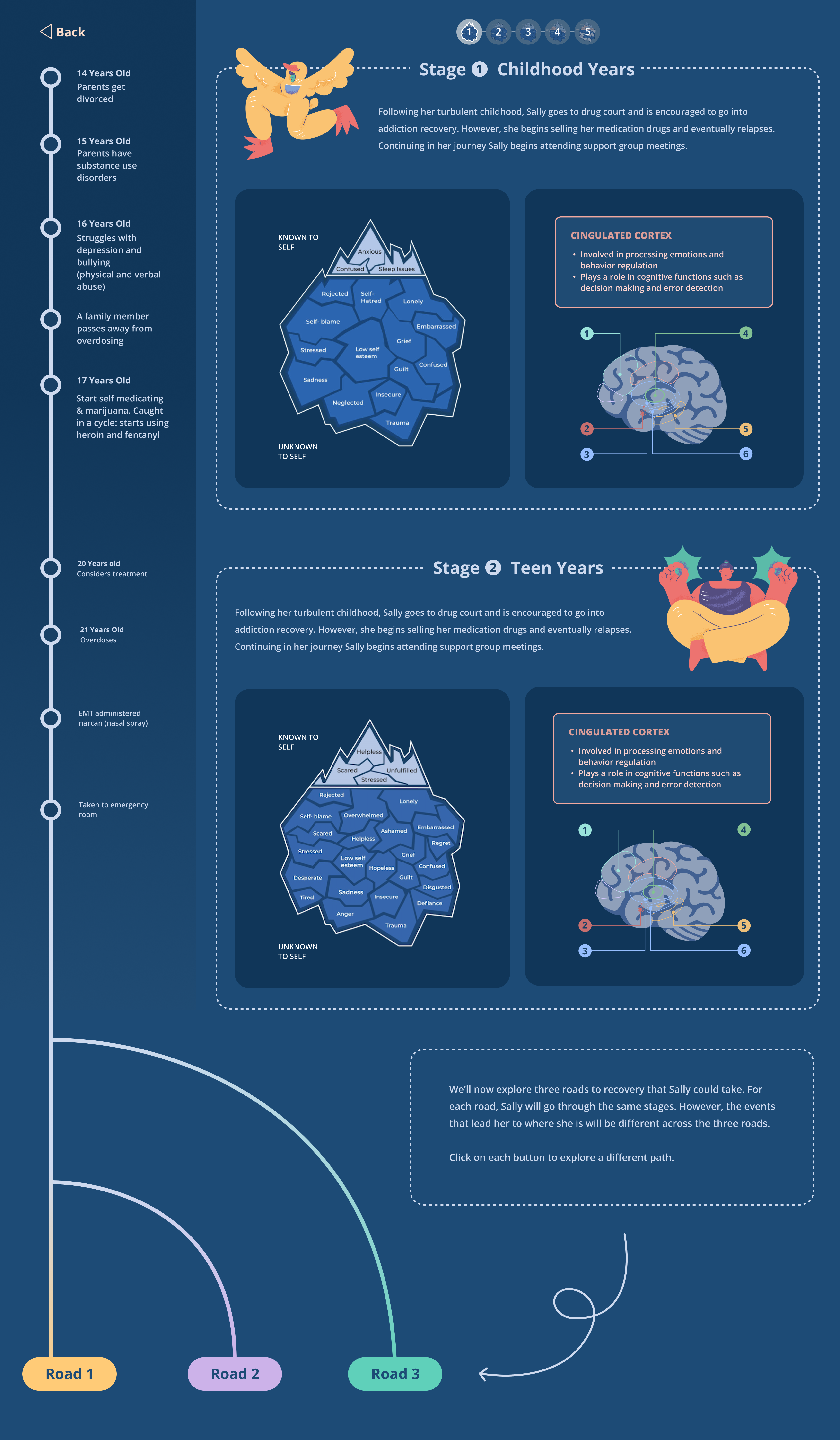
The timeline is the focal point of the journey website. Since people typically read from left to right, the timeline has been shifted from the right to the left side, with the background darkened to make it more noticeable at first glance.
The backgrounds of other components, including the iceberg and brain, have also been darkened and given card-like shapes to create a more structured layout. Each stage now features an illustration to enhance visual appeal and a summary paragraph to provide context for the information presented.
The colors of the three roads have been adjusted to darker, more saturated tones, making it easier for the audience to distinguish between the different paths.
Desktop Screen
Iteration 4: Static UI Prototype
Add three branches imagery to better demonstrate the three paths.
Show the timeline in the mobile version to reduce clicking interaction.
On the “Explore Three Roads” page (after viewing stages 1 and 2), an image of three branches is included to better illustrate the concept of the three paths and enhance user understanding. Each branch represents a different road, allowing users to choose one path while still having the option to explore the others.
Desktop Screen
More playful illustrations were introduced, with a unique illustration for each stage. These illustrations, along with summary paragraphs, will be displayed only in the desktop version to enhance the content presentation.
Mobile Screen
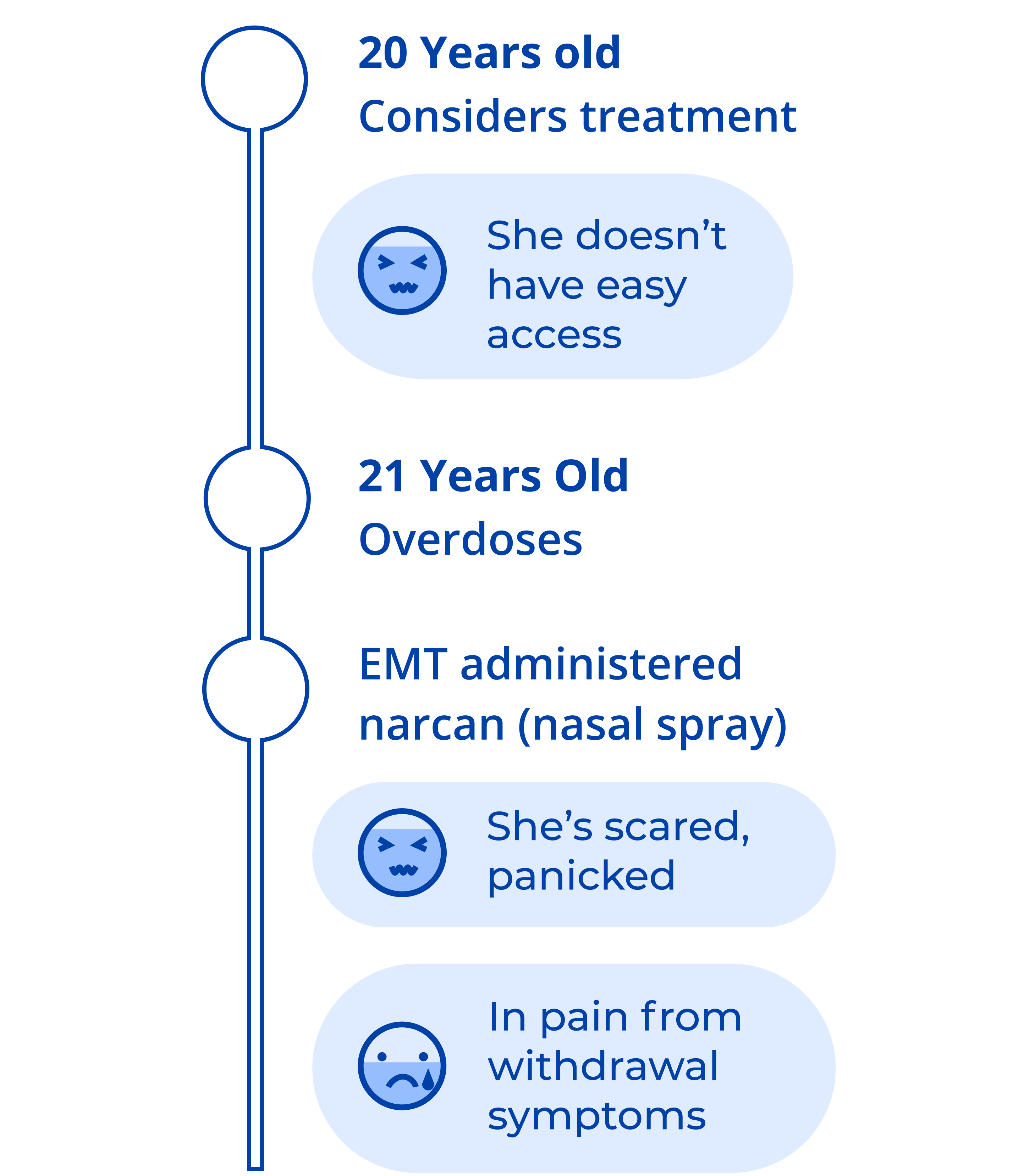
The timeline is displayed in each stage to minimize repeated clicks on the icon, with the line extending through the iceberg and brain images to connect them. Users can still choose to view only the timeline by clicking the icon.
Usability Testing Feedback
Sparse Timeline Information:
The content on some timelines appears to be limited, making them feel somewhat empty.
Distracting Illustrations:
The illustrations are a bit distracting, drawing the audience’s attention away from the timeline at first glance.
Unclear Three Branches Imagery:
The imagery of the three branches doesn’t effectively represent the concept of the three roads.
Iteration 5: Static UI Prototype
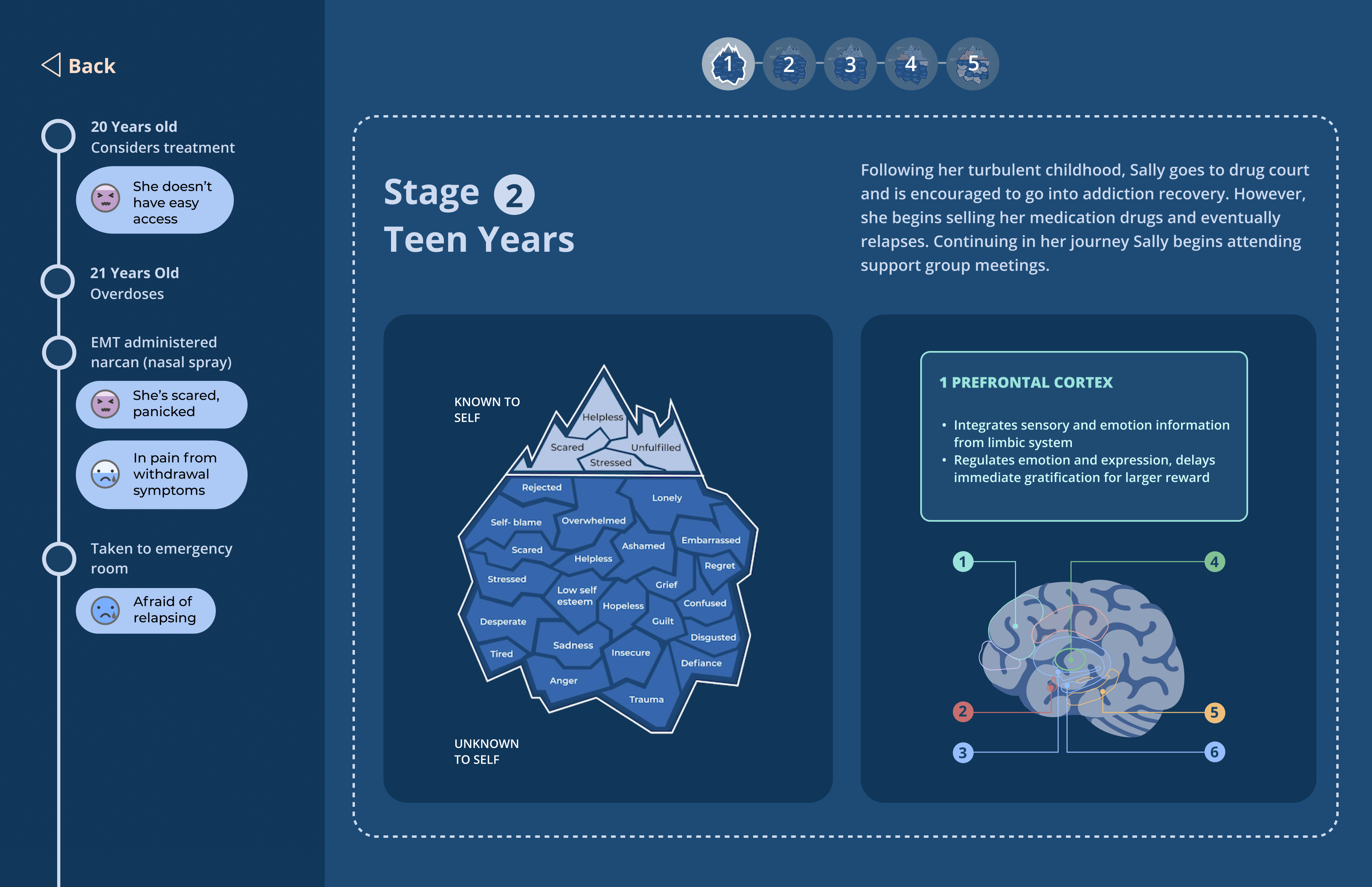
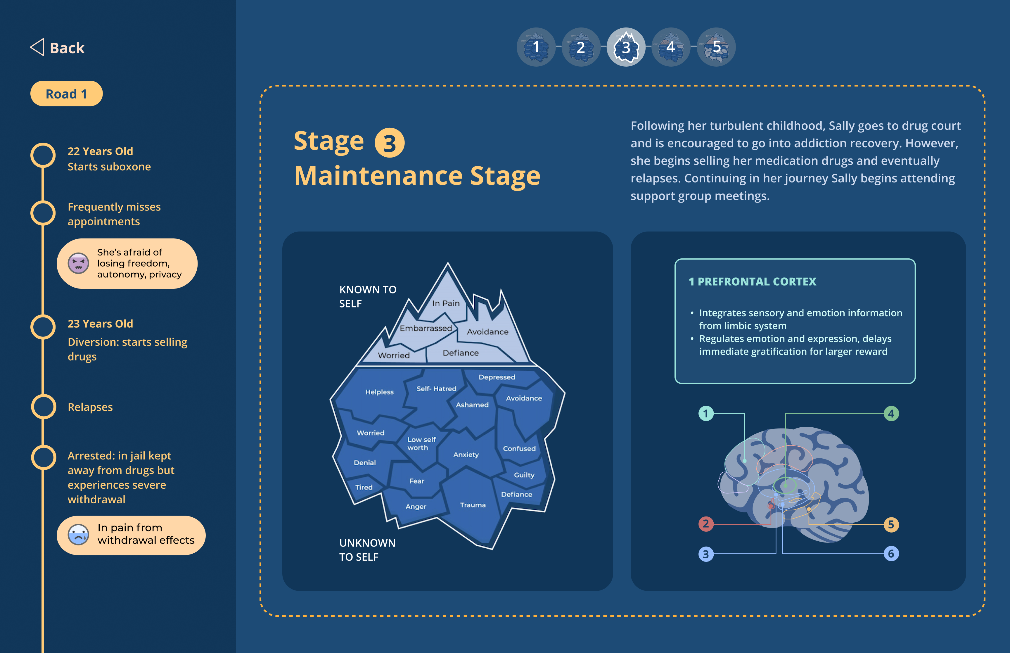
Add emotion tags to enrich timeline content.
Remove illustrations to eliminate distractions.
Emotion tags

were added beneath the events to enrich the content of the timelines, portraying the specific emotions (including emojis and text) Sally experienced at different time points.
Illustrations were also removed to reduce the distraction and encourage the audience to look at the timeline first when opening the website.
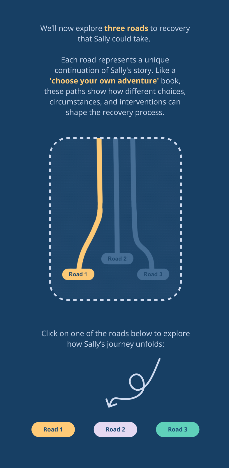
Revise the three branches imagery to better illustrate the concept.
The three branches imagery has been revised to better explain the concept of the three roads. The image is now a GIF, toggling between highlighting Road 1, Road 2, and Road 3 to demonstrate that there are three options to choose from.
Final Interactive Website
I used Webflow, HTML, CSS, and JavaScript to build the final website, which can be accessed by clicking the following link:
How to Navigate the Website?
1. Click "Next" to View the Onboarding Pages.
- Home Page:
Outlines the purpose of the website and provides information about Biomotivate, with a hyperlink to Biomotivate’s website. - Sally's Journey Page:
Introduces the character Sally and her journey from substance use disorder to recovery. - Mind Psyche Iceberg Page:
Explains the iceberg concept—depicting the emotions Sally experiences at each stage. - Brain Page:
Explains the brain and how to interact with it—this section highlights the specific brain regions and the changes associated with Sally’s experiences. - Timeline Page:
Explains the timeline—this section outlines the specific events and emotions Sally encounters at each stage, along with instructions on how to navigate the timeline.
Users can navigate back and forth by clicking "Next" or "Back".
2. Click the Numbered Circles to View Brain Region Names and Explanations.
Users can click the numbered circles to explore different brain regions and the changes associated with her experiences, with the corresponding region highlighted on the brain image.
3. Click the Iceberg Thumbnails and Road Buttons to Navigate to Different Stages or Paths.
Users can jump to a specific stage by clicking on an iceberg thumbnail. When clicking on iceberg thumbnails 3, 4, or 5 for the first time, users will be directed to the “Explore Three Roads” page. After selecting a road, users can then click on thumbnails 3-5 to navigate to the corresponding stages.
Upon completing the final stage of the current road, users will have the option to click the road buttons to switch to other paths.
Upon completing the final stage of the current road, users will have the option to click the road buttons to switch to other paths.
4. Continue Scrolling Down to View All 5 Stages and All 3 Paths.
Users can scroll down to view all 5 stages and all 3 paths. The iceberg thumbnails will track the current stage in view—when a stage is scrolled into view, the corresponding thumbnail will be highlighted.
5. If Using a Mobile Device, Click the Timeline Icon to View the Full Timeline.
To view the full continuous timeline on a mobile device, users can click the timeline icon to reveal the entire timeline and then scroll through to view the timelines for Stage 1, Stage 2, Stages 3-5 of Road 1, Stages 3-5 of Road 2, and Stages 3-5 of Road 3.




.png)
.png)
.png)
